
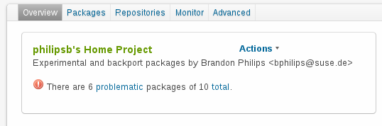
Last week I wrote a few patches to improve the UI of the build service. The first of these patches were accepted but the removal of the Actions menu wasn’t as well liked. This was the proposal:
Current Interface
The current javascript pop out menu is hard to discover and not really necessary given how much space is available in the UI.
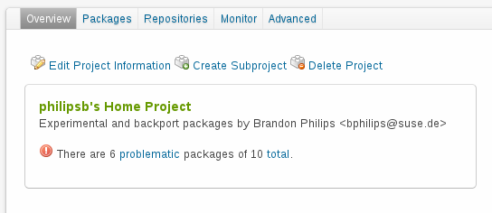
My Suggested Patch
OBS has other horizontal controls and the vertical space to handle an inline list so I submitted this layout in my patches.
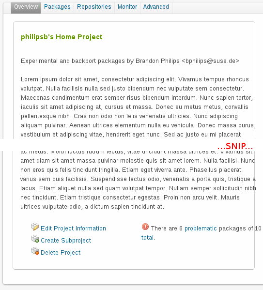
However, in the merge request Sascha suggested an alternative which I have tried out and taken screenshots of below (ignore the margin issues, I need to fix the css for the bento showleft class which breaks the 960 grid layout).
Sascha’s Suggestion
What I don’t like about this is that if you visit a project or package with a long description the really useful information about failures and the controls are below the fold and a scroll wheel away.
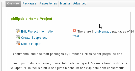
Controls on Top
I could move the controls to the top above the description but this feels like it takes up a lot of space.
What do people think? I still feel like the horizontal layout is the best option but some more feedback would be helpful.